When embarking on a home improvement project, every decision counts. From the color of the walls to the finish of the furniture, each choice can significantly impact the final outcome. Recently, we found ourselves facing a common paint dilemma: whether to use dark or white primer on our built-in bookshelves. Little did we know that this seemingly small decision would lead us down an unexpected path of experimentation and discovery.
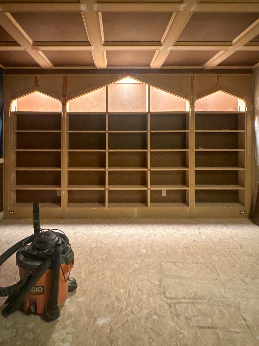
Our project began with the desire to transform our living room by painting the built-in bookshelves. We had chosen Hague Blue as the color—a bold and dramatic choice that we hoped would breathe new life into the space. This paint was also used in our mudroom makeover which used a white primer. But before diving into the paint cans, we faced the question of primer.
After some research, we came across conflicting advice. Some sources recommended using a white primer to ensure the true color of the paint would shine through, while others suggested a dark primer for better coverage, especially with deep hues like Hague Blue. Unsure of which route to take, we decided to start painting the shelves with the dark primer.
Perplexed, we continued painting, keeping a close eye on the results. After completing one block of wood with each primer type, we stepped back to evaluate. To our surprise, both sides looked virtually identical. The Hague Blue covered evenly and vibrantly on both the dark and white primed sections.k
We realized that for our project, the choice of primer might not have mattered as much as we initially thought. Perhaps it was the nature of the built-in shelves, with their numerous compartments and angles, that made the primer less impactful. Or maybe Hague Blue was simply a forgiving color that didn’t require a specific primer to achieve optimal results.
Regardless of the reason, we drew a conclusion: when using a richly pigmented paint like Hague Blue on a project with a lot of coverage, the choice of primer may not be as critical as some would lead you to believe. In our case, applying a single coat of dark primer provided excellent coverage and ensured that the final color popped against the wood.
Buoyed by our success with the bookshelves, we decided to extend the Hague Blue makeover to the ceiling, which featured coffered detailing. Again, we opted for the dark primer, and once more, we were pleasantly surprised by the results. The uniformity and depth of color on the coffered ceiling matched seamlessly with the built-in shelves, creating a cohesive and striking focal point for the room.
So, if you find yourself facing the dark vs. white primer dilemma for your next painting project, don’t be afraid to trust your instincts and try something unconventional. You might just discover that the difference is as negligible as it was for us, leaving you with more time and energy to enjoy the stunning results of your hard work.

Leave a comment